The magazine of Cairn University


Cairn magazine is published biannually by the Communications and Marketing department at Cairn University. Cairn magazine serves and advances the University’s mission by informing, equipping, and inspiring Cairn alumni and friends to serve Christ in the church, society, and the world. It is sent at no charge to over 12,000 alumni, supporters, parents of students, and friends of the University.
Additional Columns & Updates
-
Master-Minded Alumni
For over 110 years, Cairn University has been educating students to serve Christ in the church, society, and the world asbiblically minded, well-educated, and professionally READ MORE
-
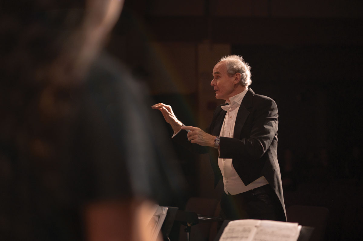
10 Reasons to Love the School of Music Right Now
God’s people are a singing people. To perform and participate in music to worship and glorify the Lord is a command set in Scripture and READ MORE
-
A Conversation with Dr. Steele Brand
Dr. Steele Brand joined the faculty in 2023 to help create and lead the politics, philosophy, and history (PPH) program at Cairn University. He recently READ MORE
-
Resurrecting the Bible of Jesus
“It’s embarrassing.” That is how I answered a question in a recent podcast interview about the Bible of Jesus—what we call the Old Testament. They READ MORE
-
The Christian Life
“Then Jesus told his disciples, ‘If anyone would come after me, let him deny himself and take up his cross and follow me.’” Matthew 16:24 READ MORE
-
Behind the Barber Chair
While Ethan won’t have “barber” on his diploma from Cairn, he will graduate with a new and lasting trade that he picked up early in READ MORE
-
From the President: Spring 2024
This past year, a new book was published entitled Christian Higher Education: An Empirical Guide. The authors, Perry L. Glanzer, Theodore F. Cockle, and Jessica READ MORE